Time Use in Kosovo
News
Analysis
Time use
Data Viz
Labor Force
ggplot2
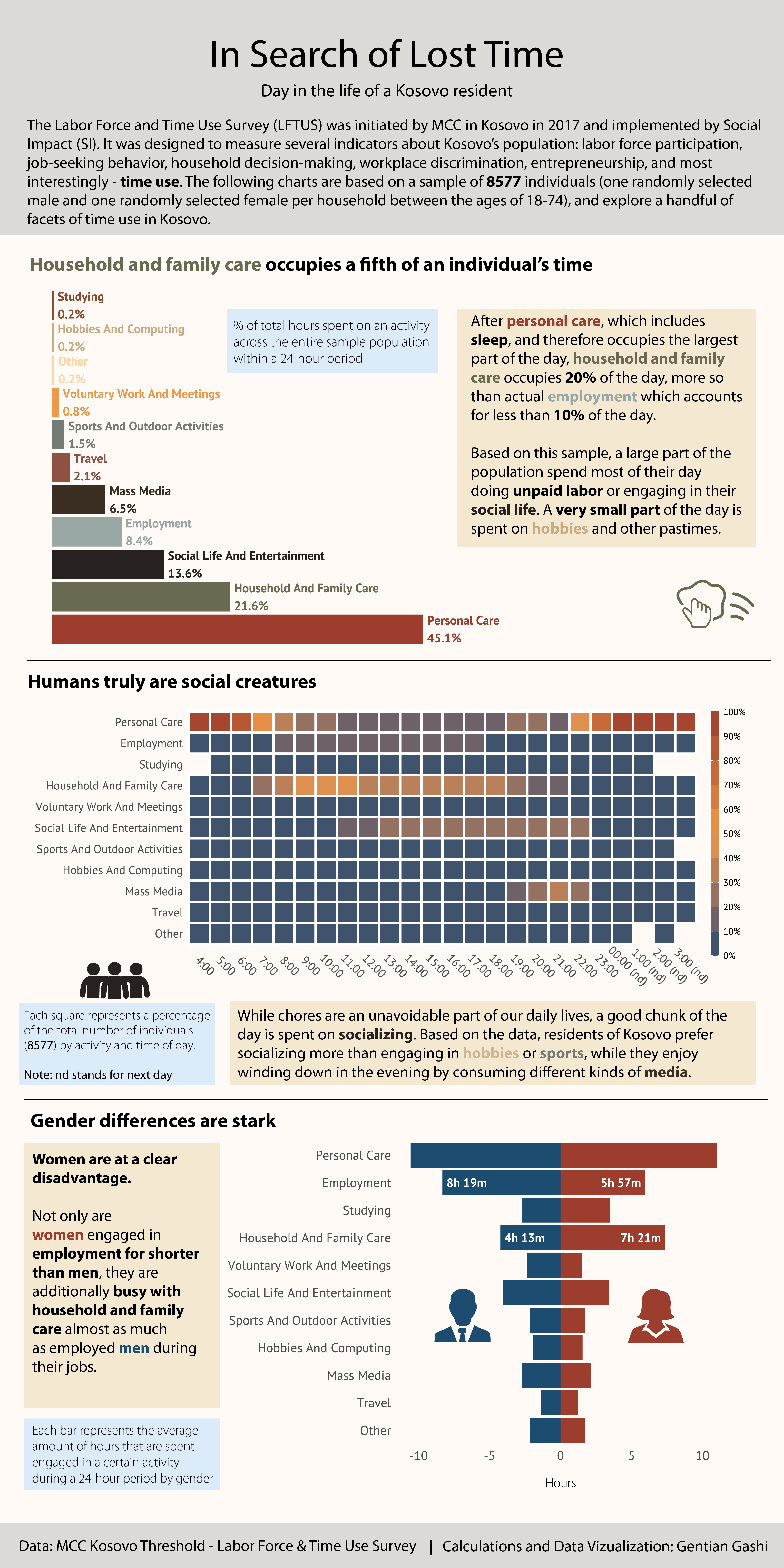
The following infographic analyzes time use data from a survey conducted in Kosovo in 2017. The data was analyzed and visualized via R. The graphs were combined and finalized in Adobe Illustrator.
This project and source code can be found on my GitHub page.